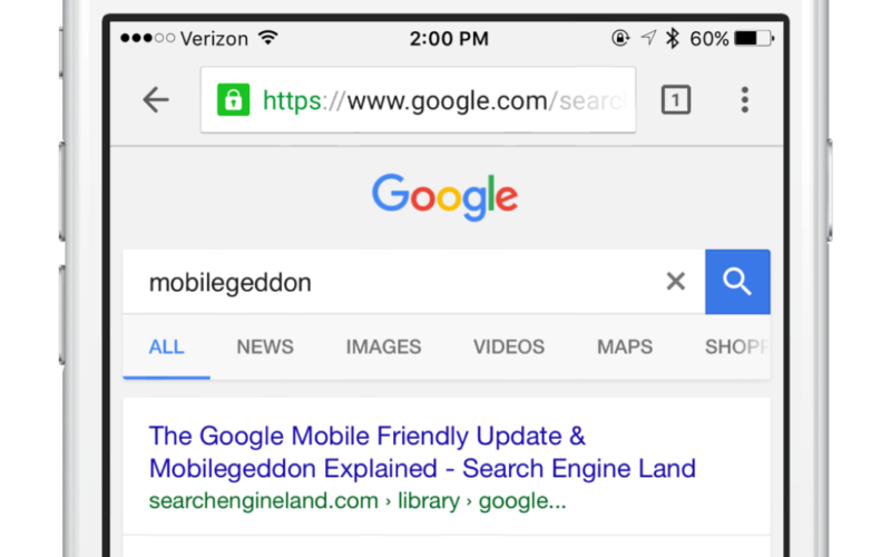
In an update rolled out last week, Google strengthened its infamous mobile-friendly ranking signal further – making it all the more important for webmasters to host sites which meets Google’s exact standards.
With that in mind, how can you make sure that your site is up to par? We’ve put together a handy mobile-friendly checklist – listing the things you should, and shouldn’t do, in order to squeeze the most out of Google.
Kick Flash to the curb
Many mobile browsers can’t render Flash-based content properly, so follow one clear rule of thumb for creating mobile-friendly sites: don’t turn to Flash. Google’s mobile usability report recommends that you use “modern web technologies” to display page content, animations and navigation instead.
Set your viewport properly
A viewport is a meta tag that gives instructions to the browser on how to adjust dimensions and scaling to different widths. Ideally, the viewport should appear in the header of your site.
Don’t set your viewport to a fixed width. Some will define the viewport to a fixed pixel width in order to suit common mobile screen sizes, but this won’t be suitable for every device, and Google won’t see it as being mobile-friendly.
Select a larger font
If you’ve configured your viewport properly, font sizes will be scaled according to the user’s device, but Google makes some additional recommendations on top of that.
It recommends using a base font size of 16 pixels, with any other sizes defined relative to that baseline. The vertical space between lines should be set at 1.2em.
You should also try to avoid using too many different fonts and sizes, which more often than not leads to messy and complicated layouts.
Give links and buttons extra legroom
Links and buttons are notoriously harder to press on a mobile device compared to the traditional desktop browser.
Google will penalise pages where the ‘tap targets’ (just another term for links and button) are too close together to press accurately.
The average finger pad is around 10mm wide, so Google recommends a minimum target size of around 7mm, or 48 pixels wide for the most important targets, such as navigational links, search bars and form fields.
Don’t be tempted to use full-screen pop-ups
Large or full-screen pop-ups and overlays can be extremely disruptive to the user experience on a mobile device.
A big, attention-grabbing pop-up might seem like a good idea from a business perspective, but Google recognises that they can interfere with the UX and will penalise sites that use them.
Instead of a full-screen pop-up, consider using a banner or implementing app indexing, which will allow content from within your app to appear in search results – making it an effective method of promotion.
Run the site through Google’s toolset
The easiest way to double-check whether your site is hitting the right notes for mobile-friendliness is to use the tools Google has provided.
Search Console, formerly known as Webmaster Tools, has a ‘mobile usability’ section that will diagnose any lingering issues with your site. As of May 2016, you can even find insightful mobility data in Google Analytics.
You can also check the overall health of individual pages by pasting the site’s URL into Google’s revised Mobile-Friendly Testing tool.
Chasing the need for speed
In its recommendations, Google suggests asking your developer to “make a commitment to site speed”.
Whilst Google doesn’t directly hone in on slow loading times, we know that speed undoubtedly is a ranking factor, and statistics show that slower speeds can cause users to abandon their journey.
If you want to provide the best user experience and give your mobile-friendly the chance to receive a higher search ranking, consider speeding it up as much as possible.
Google’s PageSpeed Insights tool has a ‘mobile’ tab which will give your site a speed rating out of 100, with advice on how to fix individual elements.
It will also flag any mobile issues in the same way.


Comments are closed here.