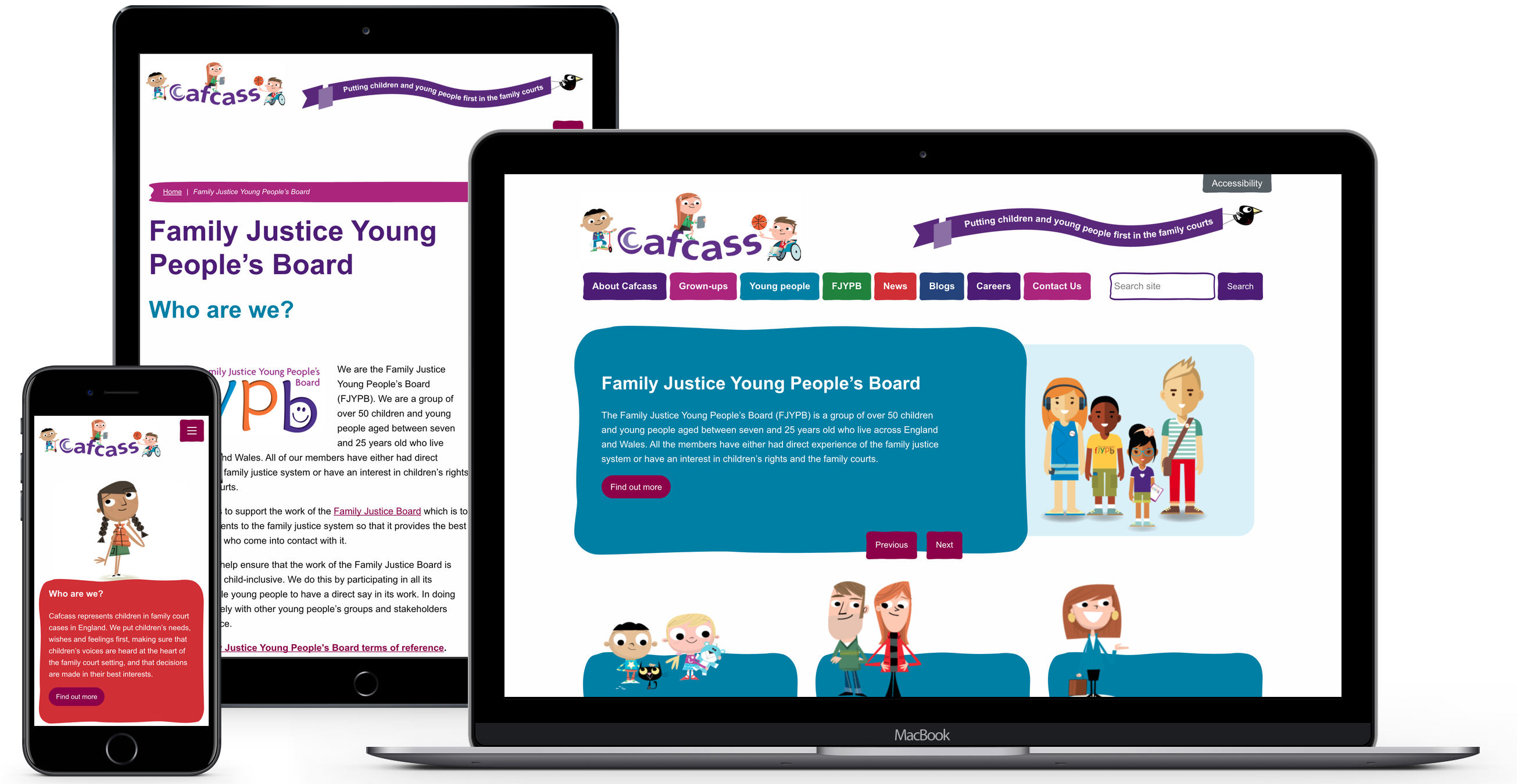
Focus was placed on creating a design that communicates empathy – the website must establish a connection with each user, so that interaction is positive, and they can find what they are looking for quickly.
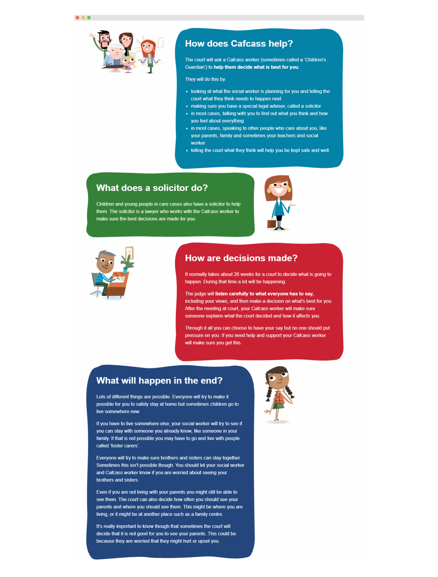
Unique character illustrations help to drive Cafcass’ story and affirm their independence. Imbuing characters with humanity was important to create a connection with the end user. This is one of several aspects that helps to provide a positive, dynamic feel, reflecting the benevolent roots of the body.
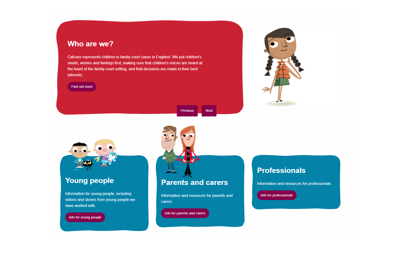
Content cards and sliders provide greater flexibility for Cafcass when it comes to highlighting important content, ensuring the site always appears fresh.
With concise, colourful headers, users can find and navigate to important areas in just a few clicks. The functional user interface helps to improve perception of the site.
White space also plays an integral role in the visual design, improving text comprehension, focus and interaction in order to maintain composition and balance.
Through the design, build and delivery of a rich, responsive website with informative content, we utilised digital technology to better serve Cafcass’ audiences. We have enhanced the user experience, made interaction more intuitive and improved access to content. In doing so, we have aided Cafcass’ long-term objectives and provided an enduring platform that will inform and provide help to users for years to come.


